H.R. 7517
Graphic Design
To provide that the rules entitled "Religious Exemptions and Accommodations for Coverage of Certain Preventive Services Under the Affordable Care Act" and "Moral Exemptions and Accommodations for Coverage of Certain Preventive Services Under the Affordable Care Act" shall have no force or effect, and for other purposes.


Why birth control?
Birth control serves many purposes beyond preventing pregnancy. It regulates menstrual periods - decreasing cramps and relieving symptoms of PMS and PMDD. It helps treat acne and lower risk of anemia, endometrial and ovarian cancers. Women depend on birth control for treatment of Polycystic Ovary Syndrome (PCOS), as well as preventing and lessening serious infections in the ovaries, fallopian tubes, and uterus and cysts in the breasts or ovaries. Policies that allow the exclusion of birth control access from company insurance plans can cost the health of employees who depend on birth control for any of the issues above.
H.R. 7515, also known as the Protect Access to Birth Control Act would reverse the "Religious Exemptions and Accommodations for Coverage of Certain Preventative Services Under the Affordable Care Act" which allows companies to exclude birth control due to "religious beliefs". The Protect Access to Birth Control Act ensures that employees who depend on birth control get covered.

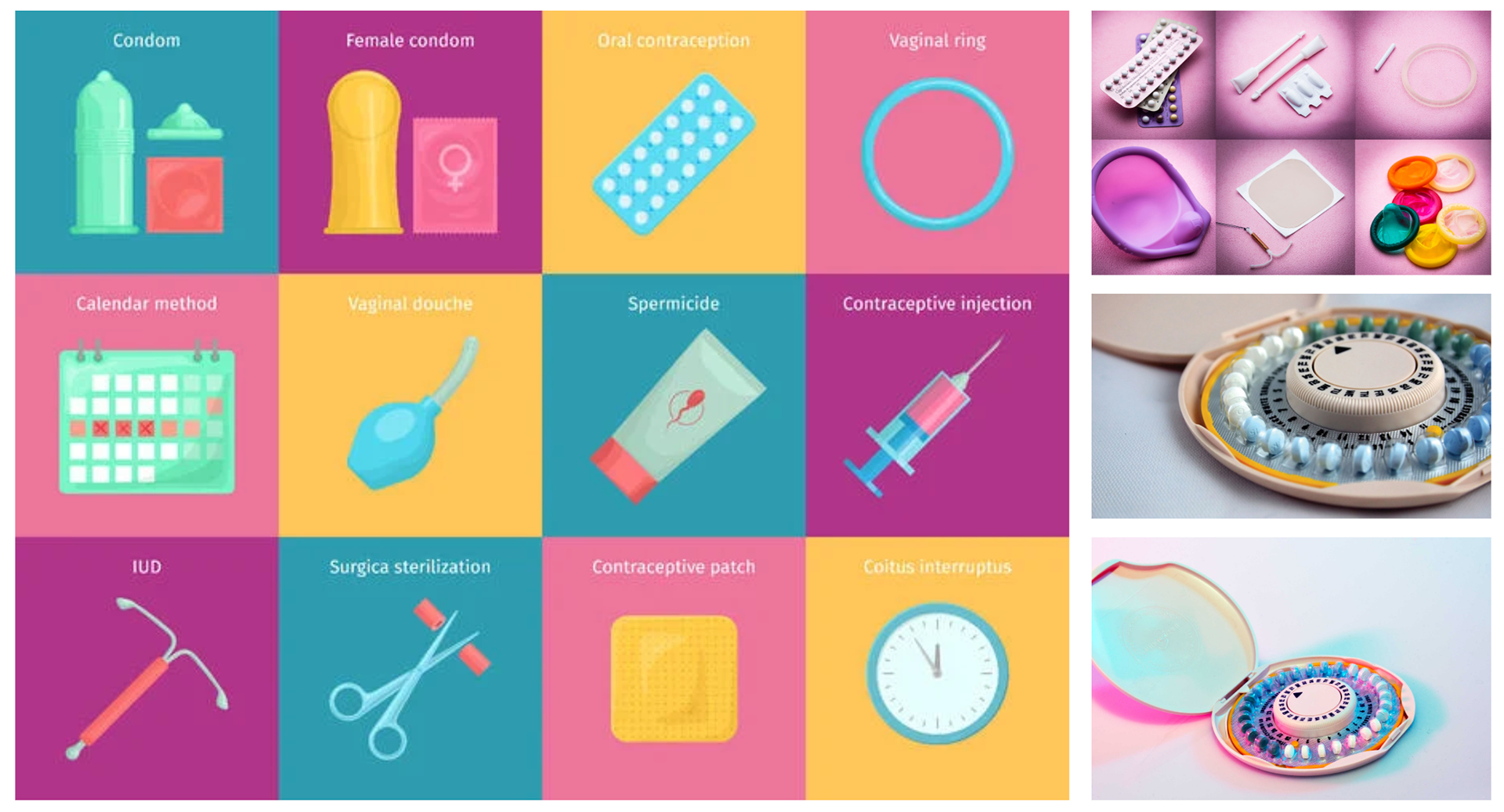
Part of my process included researching existing symbols for birth control. There is more than one form of birth control (above, left), therefore, it can be represented multiple ways. I originally wanted for my symbol to encompass all types of birth control - pills, condoms, IUDs, etc - however, that would require a whole new symbol that people may not recognize. I was having a hard time brainstorming symbols that would spark the concept of "birth control" (shown on above, right).
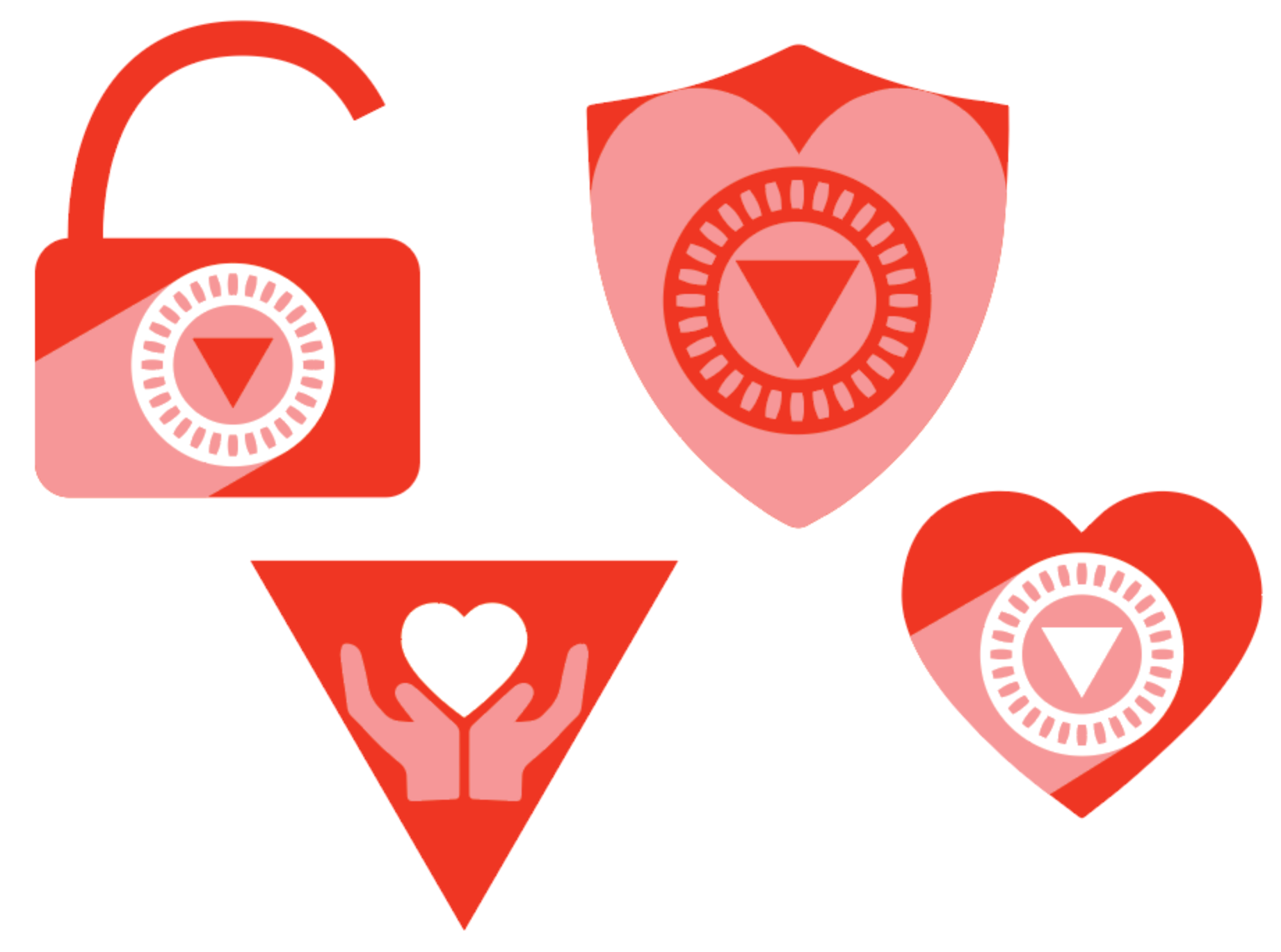
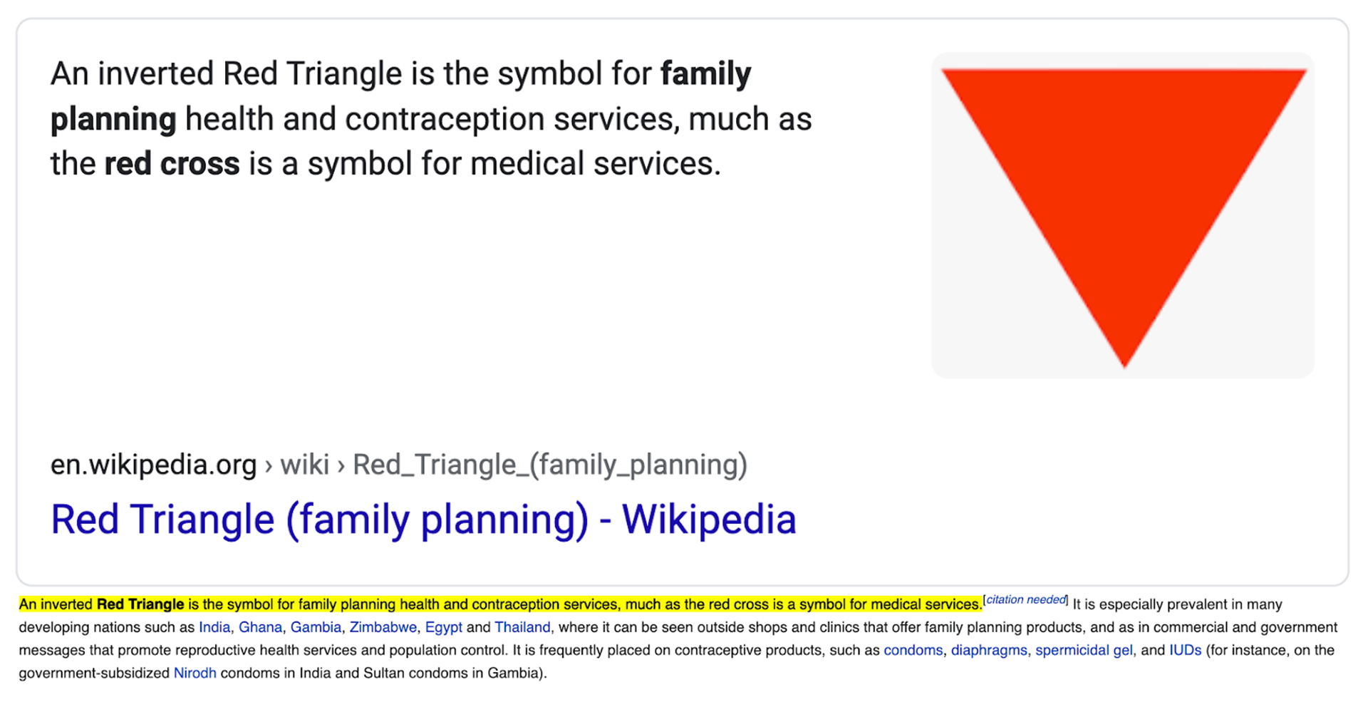
I continued to research and found that contraceptive services can also be symbolized by the inverted red triangle. I decided I wanted to make use of this and include that red color in my design, as well as play around with the shape. I chose to center down my focus on contraceptive pills and their original dial form, as they are "the classic" form of birth control.
Below on the left are the first round of iterations I did. I ended up deciding to focus on the shield center instead of the triangle center for two reasons. First, the inverted red triangle, after more research, I found was also a symbol used for war prisoners in the concentration camps in WWII. Second, I found that when surrounded by the dial, it almost appears like the Iron Man symbol. The shield was a good way to avoid these misconceptions by symbolizes "protect" while still looking similar to the red inverted triangle for contraceptive services.

